

Wine Weaver
Mac artist innovates with labels
McMinnville resident Alice Van Leunen is a lifelong fine artist. She has seen her work appear in numerous prestigious publications, featured in dozens of gallery and museum exhibitions, purchased by public and private collections, employed in enormous outdoor installations, and commissioned by organizations not only around the country but as far away as Indonesia.
Being among the few fine artists able to make a living exclusively through her work is a considerable accomplishment in itself. But, even though her past work entails substantial size and scope, she’s far from ready to rest on her laurels. For this visual creator, making art continues to elate and she wants to keep it that way as long as she can.
Born in Indiana, Van Leunen earned her undergraduate degree at Smith College in Northampton, Massachusetts, then did graduate work in Fine Art at Indiana University before moving to Oregon in 1970. For the first half-dozen years, she produced, “loom-woven artworks, primarily wall weavings of landscapes and clouds inspired by the natural environment of the Pacific Northwest.”
Developing an innovative approach was a natural evolution of Van Leunen’s art. In recent years, her unique technique has found a most fruitful focus: the Oregon wine industry. Pacific Northwest inspiration strikes yet again.
“Living right here in the heart of wine country, I began visiting winery tasting rooms,” she said. “On one of those trips, I met David Fish, the owner of Fox Farm Winery in Dundee. We talked a bit, and when he discovered I was an artist, he gave me several of his labels and said, ‘See what you can do with these.’”
Shifting her right-brain into high gear, Van Leunen laid out the labels and envisioned the creative possibilities. It occurred to her by using several labels together, repetitive patterns could be created from which to build a complete design statement emulating the classic log cabin quilt pattern.
It seemed a natural extension of what had already become a hallmark of her recent work, wherein flat strips of paper rather than threads of fabric, were woven in an under-over box pattern similar to the waffle weave.
So, she embarked on the local wine trail in search of a different form of satisfaction. Rather than wine tastes, she wanted wine labels. Her requests were mostly met with piqued curiosity and ready cooperation. “I got to know a lot of tasting room managers as well as some owners, and I did taste some very nice wines in the process,” she said.
Labels in hand, Van Leunen cuts them into segments, adhering them to sturdy paper backing and arranging patterns to arrive at selected designs. Before beginning work, she prepares a woven base sized for the final piece. The label segments are then pasted down to form dramatic collages. So far, nearly four dozen predominantly Yamhill County wineries have served as subjects for these wine country compositions. At last count, she had collected labels from more than 100 Oregon wineries for the creation of additional paper masterpieces
If the design components are strong, a single winery’s labels can combine into a wonderful piece all its own. Not all labels lend themselves to the concept owing to over-simplified design, lack of color, font size, dark on dark, or light on light.
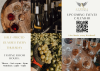
A successful single winery design is the Lenné/Le Nez piece shown with this story. The prominent nose, “Le Nez,” is an ideal repetitive graphic, as is the bold typestyle. It works even though the winery name “Lenné,” in pink, recedes because of its soft color on a tan background. Multiple wineries have worked well, as seen in the three quilt designs also shown here – one incorporating 26 wineries, another 22 wineries, and another, nine.
Looking closely at the Lenné piece, you’ll see overlapping box weave design segments that form the single blue-green color of the border. Trace these segments to the edge of the design. Notice how they extend across the entire piece and out the other side. Note also how these “strip” segments go from less to more, overlapping as they proceed from the outermost segment to the center.
The roots of this original approach can be traced to Van Leunen’s evolution as a fine artist. In 1976, her work with textiles and paper came to the forefront when she and two other artists, Marie Lyman and Susanna Kuo, formed a collaborative relationship called NEXUS. They worked together on the development and completion of several projects spanning a 10-year period.
In 1980, Van Leunen began teaching a textile class for the art department at Portland State University. When the NEXUS collaboration ended in 1985, Van Leunen continued to create woven landscapes and folded geometric forms based on the Japanese paper art form “origami,” as an outgrowth of artworks she and her partners had co-created.
When her Portland State class was discontinued in 1991, she merged disciplines and developed a creative process for client-specific projects. In 1993, she received an Oregon Arts Commission Individual Artist Fellowship to focus on her woven paper art. Paper, textile weaving and visually arresting designs combined and intertwined to create a synergism called, crediting its creator, the Van Leunen technique.
An original, multi-label piece is being created by Van Leunen for “GRAPE OREGON: Six Decades of Distinction,” a book on the history of the Oregon wine industry by retired OWP Associate Editor Karl Klooster. Publication date to be announced.